In Colour

In Colour
2022 - 2024

Tuesday, 17 November 2015

Happy Scene of Christmas - On Stage Melbourne swap 2015

Our first On Stage Local event in Melbourne, November 2015.
I wish I'd had more time to prepare myself...& more sleep too. It can get tricky when you're working full-time and have a family.  But I did get about 20 swaps made...better than none I guess.
One of the only stamp sets I managed to get from this seasonal catalogue was Happy Scenes, so I thought I'd better put it to use.
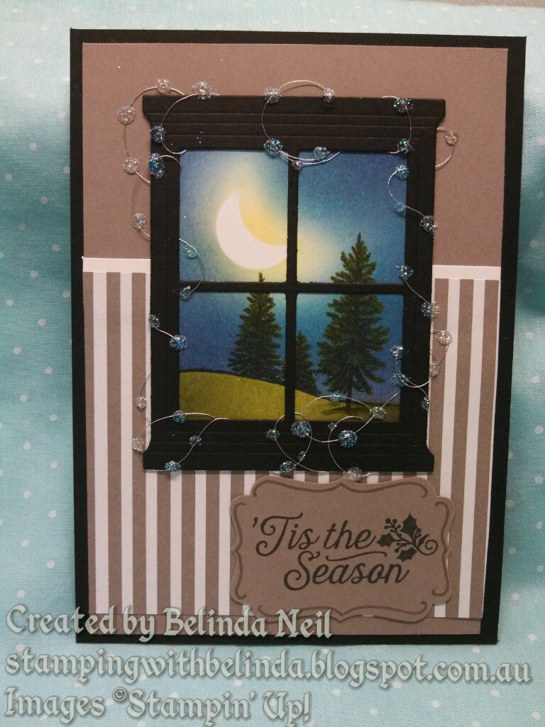
Stamps: Happy Scenes & Oh,What Fun.
Card Stock: Basic Black, Whisper White, Tip Top Tuape & Envelope paper.
Ink: Daffodil Delight, Bermuda Bay, Tempting Turquoise, Pacific Point, Elegant Eggplant, Old Olive, Mossy Meadow, Always Artichoke & Memento Black.
Tools: Hearth & Home Framelits, ¾ Circle punch + Decorative label punch.
Extras: Dotted Lace Trim, Silver Metallic Thread, Crystal Effects & Dazzling Diamonds.

Techniques: Masking & Sponging, Colouring with Markers (trees), 3D Crystal Effects (Christmas lights).

Stamps: Happy Scenes & Oh,What Fun.
Card Stock: Basic Black, Whisper White, Mint Macaron & Envelope paper.
Ink: Daffodil Delight, Bermuda Bay, Tempting Turquoise, Pacific Point, Elegant Eggplant, Old Olive, Mossy Meadow, Always Artichoke & Memento Black.
Tools: Hearth & Home Framelits, ¾ Circle punch + Decorative label punch.
Extras: Dotted Lace Trim, Silver Metallic Thread, Crystal Effects & Dazzling Diamonds.

Techniques: Masking & Sponging, Colouring with Markers (trees), 3D Crystal Effects (Christmas lights).

I had made one white version because I had not cut enough black windows, yet had a spear white window handy. After I put this one together I decided I actually liked the white one better but I'd forgotten to add the Christmas Lights.

Sponging the Happy Scene.
Stamp image onto Whisper White cardstock with Memento Black ink.

Stamp the same image on to a post-it note to create a mask. (be sure to stamp over the stick portion of the post-it note)

Cut the post-it note along the horizon of the image. (you should get a bit of sticky under both the land & sky portions). Here I have just added an extra bit of post-it note because my mask was a bit short.

Next stick another post-it note to a piece of cardstock and punch out a 3/4" circle. (the cardstock makes it easier for the punch to get through the post-it note with a clean cut)


Stick the 3/4" circle to the sticky edge of the post-it note to allow you room to feed it back into the circle punch while still hanging onto it
.
Punch off roughly half a portion of the circle, This creates the crescent moon shape.

Peel off the post-it note crescent from the cardstock and place the moon mask in the sky.

First colour for sponging, Daffodil Delight.

Start by inking the sponge (I press the sponge firmly onto the ink pad).

Then tap off the excess ink onto scrap paper  (this helps eliminate the grainy texture).

Softly sponge the daffodil delight ink around the moon ( it helps to follow the shape of the moon to avoid ruining the mask).

Next colour Bermuda Bay. Ink up, tap off and again softly add the colour around the moon. Start with a wide large circle, gradually bring it in closer to the moon, slightly over lapping the yellow. You may need to use a smaller circular motion to bring the Bermuda Bay into the crescent side of the moon.

Next Colour, Tempting Turquoise. Same as above, ink up, tap off and use soft circular motion. I always find it easier to work toward the colour I'm about to overlap.
(Remember, you can always come back and add more colour)

Next colour, Pacific Point. Same as above. Ink up, tap off & soft circular motion.
(In real life you can see the colours starting to build up a nice intense depth, yet still softly glowing around the moon). 

Last sky colour, Elegant Eggplant. Same method as above, ink up, tap off and sponge in soft circles.
This colour really brings depth to the inky night sky.

Sometimes if I want to get a really nice blending of the colours, I will go back over the whole thing in reverse, so the lighter colours fill in any tiny gaps the darker colours may have left behind. You can skip this step if you like, but I think it works better and almost always go back over with the lighter colours (except the yellow in this case).

Remove the moon mask.

Remove the land mask.

Add the other part of the mask to cover the sky.


I started with Old Olive for the grass (because it doesn't snow at Christmas time in Australia, I'm doing a green grass land), I didn't bother to tap off the excess ink for the land, just ink up and sponge straight on using a downward sweeping motion. 

I couldn't just use one green now could I? :)
I sponged Mossy Meadow around the bottom and edges using a circular motion.
I figure the moon would shine down on the lighter patch of grass. 

Remove the sky mask.

To colour the trees green, I used an Old Olive Marker on the tops and the side I thought the moon should shine on. (Brush on in a flicking stoke motion) 
I also added a little to the horizon line and the shadow of the tree. (This is useful to fill in any spots missed while sponging)

Next colour, Always Artichoke. this green is darker than Old Olive therefore can fill in the rest of the trees nicely. (I didn't have Mossy Meadow in a Marker, or I would have use that instead)


Sponging colours: Sky- Daffodil Delight, Bermuda Bay, Tempting Turquoise, Pacific Point & Elegant Eggplant. Ground- Old Olive Mossy Meadow.


They are all just a little bit different.

To create the Christmas lights around the window I just added some tape to the back, took off one side at a time, and wrapped the silver Metallic Thread around it. Once the window was adhered to the card front, I then dabbed little dots of Crystal Effects over the sliver thread, then sprinkled with Dazzling Diamonds. That looked good at first, but as it dried I think the glitter flattened it out, so I added another dot of Crystal Effects on top for the 3D Effect.


Shari and myself taking some happy snaps.

Tuesday, 8 September 2015

Perfect Peacock - In Purple

The colours don't seem to look right in the photos, but turned out really nice in real life.
 The Peacock is embossed in gold onto vellum, then coloured with Stampin' Write Markers.
The Stampin' Write Markers are not quite the same as the Blendabilities (because they are a water based ink, they don't behave the same as an achohol based ink), but using them on the vellum is great, because you can blend  and lighten the colours using the Blender Pen. You can also colour on the front or the back of the vellum depending on the look you want to achieve.
 Stamps: Perfect Peacock & Flowering Flourishes
Cardstock: Blackberry Bliss, Daffodil Delight, Crumb Cake & Vellum
Ink: Versa Mark, Daffodil Delight, Pumpkin Pie, Old Olive, Always Artichoke, Wisteria Wonder, Perfect Plum, Elegant Eggplant, Rich Razzleberry & Calypso Coral
Framelits: Apothecary Accents
Extras: Gold Embossing Powder, Blender Pen & Blackberry Ribbon

 I'm just trying to show how nice the gold embossing powder looks with these colours on the vellum.
(It's always tricky to get a good photo of gold on cards while capturing the other features too)


I layered the vellum onto Daffodil Delight card stock because it went with the colours in the card and gave it a warmer - softer finish.

This card didn't out as good as the other one, but I've used the same basic colours to colour in, except I've embossed with silver onto Whisper White card stock and used the inks to watercolour the image.

Sunday, 30 August 2015

70th Birthday card - Fish in the water

I was asked to do a 70th birthday card for a man who liked fishing... so after thinking about it for a little while I remembered seeing a card my friend Katrina had done several years ago using gel and glitter.
Here is my version of the gel & glitter underwater theme card.
I didn't have any hair gel in reach, but I did have hand sanitizer, so that's what I used instead. (Although I think that hair gel might have been better because it's thicker than hand sanitizer).
Note: The stamped, embossed fish are behind the plastic bag of glitter & gel, not in.

Stamps: Back to Basics Alphabet, By the Tide & Hardwood
Cardstock: Baked Brown Sugar & Whisper White
Ink: Memento Black, Baked Brown Sugar, Soft Suede, Pacific Point Tempting Turquoise, Wild Wasabi, Smoky Slate, Blushing Bride & Versa Mark
Framelits: Circles
Embossing Powder: Silver & Clear
Extras: Linen Thread, mini Brads, Dazzling Diamonds Glitter, snap lock bag & gel

The glitter seems to settle to the bottom after a while, but when you squish a little it stirs back up into the scene. Keep in mind when adding the glitter it's best to start with just a little bit...you can always add more, but it's not so easy to take it out!
These pictures were taken in the sun light. Here you can see that I've cut the middle fish out & stuck over the other two, this give more of a 3D effect.


This card is fun! You just can't help playing with it, because the bubbles & glitter move around when you squish it... you just want to squish it more.


Tuesday, 28 April 2015

No-black-outline Colouring - Pink & Blue Bird - Gold Coast Convention Swap 2015

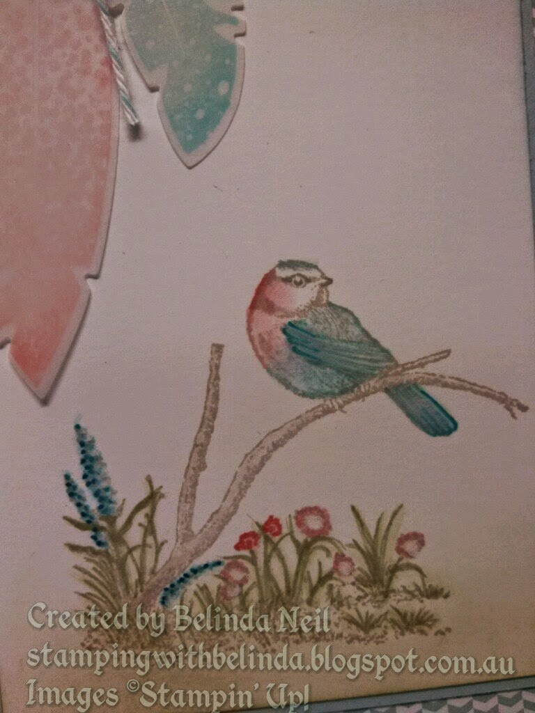
In the previous post I showed step-by-step photos of the "no-black-outline" colouring technique. In this this post it's much the same technique (but with a slightly different card) & with bigger pictures to help show the steps I've used a bit better.
Pink & Blue Bird
Stamp Sets:Moon Lake & Wetlands
Card stock: Naturals White, Whisper White, Vellum, Soft Sky & Soft Sky Subtle's dsp
Ink: Old Olive Sahara Sand, Crumb Cake, Soft Sky, Pool Party, Coastal Cabana, Tempting Turquoise, Pacific Point, Blushing Bride, Calypso Coral & White Gel Pen
Tools: Blender Pen, Spiral Boarder Punch & Four Feathers Framelits
Extras: Pool Party Bakers Twine & Antique Brads
Techniques: Sponging, Dauber to stamp & No-black-outline Colouring


Stamp the image in Sahara Sand. Lightly sponge Soft Sky ink over the sky & Pear Pizzazz ink over the ground.
I coloured in the image using a Blender Pen & ink from the lid of the ink pads. 
Sahara Sand for the branch.
Blushing Bride for the chest.

Calypso Coral on the cheek.

\
Coastal Cabana for the birds body, wing, tail & top of the head.
(Coastal Cabana was the colour I used for the first sample I made, but on the swaps I used Soft Sky)

Pacific Point at the top of the wing & tip of the tail.

Old Olive is the colour I used for the grass & leaves here, but on most of the swaps I used Pear Pizzazz.

Crumb Cake for the beak & eye (Swaps were Sahara Sand).

Pool Party for Most of the birds outline (all blue areas). & dot it along the tall flowers.

Blushing Bride on the small flowers & the birds chest.


Calypso Coral on the birds cheek. (I may have added a little bit to the flowers).

Pacific Point, along the side of the tall flowers. 
I used Tempting Turquoise on the top of the wing tip of the tail, on the swaps, but as this was my sample I didn't get a photo. 

Next I used the Blender Pen to soften the image by going over all the marker outlines.


Pink & Blue Bird
Stamp Sets:Moon Lake & Wetlands
Card stock: Naturals White, Whisper White, Vellum, Soft Sky & Soft Sky Subtle's dsp
Ink: Sahara Sand, Soft Sky, Pool Party, Tempting Turquoise, Pacific Point, Pear Pizzazz, Blushing Bride, Calypso Coral & White Gel Pen
Tools: Blender Pen, Spiral Boarder Punch, Itty Bitty Banners & Four Feathers Framelits
Extras: Pool Party Bakers Twine
Techniques: Sponging, Dauber to stamp & No-black-outline Colouring