In Colour

In Colour
2022 - 2024
Showing posts with label Clear Embossing Powder. Show all posts

Monday, 23 March 2015

Dad's Birthday card- World Map & The Open Sea Coloured with Blendabilities

It was my Dad's birthday this month, & since he likes old maps with ships and whales or some crazy old fashioned monstrous sea creatures on them ... this was the card I made for him (minus the sea creature). 

I am so disappointed to here that the Blendabilities have been discontinued, even though I had made this card before discovering this, I thought I would still share it anyway.
Stamp Sets: World Map & The Open Sea
Card stock: Naturals White, Whisper White & Soft Suede
Ink: Memento Black, Soft Suede & Basic Gray
Blendabilites: Old Olive, Daffodil Delight, Crumb Cake, Ivory, Natural, Bronze, Bermuda Bay, Soft Sky, Smoky Slate & Night of Navy.
Punches: 2 1/2" Circle
Extras: Linen Thread & Clear Embossing Powder

Colours used in the card.
Colouring the water.


Making a start on the land. Mapping out green & dry land.

Filling in the land & trying to add some mountains & ridges.
Sometimes you don't have the right colour for the job, but you can mix up your colours a bit. Try adding say a darker colour to your acrylic block, then picking up some of that colour on the tip of a lighter (or just different) colour marker, as you colour with the marker the darker colour will blend with it then fade out as it returns to the original colour. Note: If you do this, it is a good idea to scribble off all the excess colour on to scrap paper before you put the lid back on. You don't want to risk it staining the marker.
Staz-on Cleaner & wet wipes or paper towel will clean off any left over Blendabilities from the acrylic blocks.

This is what the map looked like after I added colour after colour & layer after layer.
I'm not even sure if I took a picture after every colour I used or if I've even put them on here in the right order, but you get the idea. There's no right or wrong way to colour with blendabilities, it's just a matter of practise, & as crafters we learn to hide our mistakes with embellishments... : )


Colour the ship.

The embossing process before the crackle effect.

After I had embossed the circle of card stock with the coloured ship at least 6 times, I put it in the freezer for about 10-15 minutes, then bent it and twisted it to get the "cracked glass effect".

Of course no old map would be complete without some sort of distressing.
I sponged all around the edges with Baked Brown Sugar.
 Cutting out the anchor can be fiddly, but it's worth the effort to be able to wrap some twine or thread through it like old rope.

To see the first card I made with the World Map & Blendabilities click here.

Thursday, 25 September 2014

Holiday Homes

This was the card I made for our local demonstrator swap. I don't know who to give credit to after seeing so many fantastic silhouette house cards on stampinconnection. Whoever thought of the idea is brilliant, & I just loved it. So this is how I made my version of the night before Christmas...
Stamps: Holiday Homes & Good Greetings.
Colours: Night of Navy, Whisper White Memento Tuxedo Black & Daffodil Delight.
Extras: Holiday Homes Framelits, Blendabilities, Clear Embossing Powder, Brayer, 1"Circle Punch, Masking  & Sponging

Stamps: Holiday Homes & Good Greetings.
Colours:  Basic Black, Memento Tuxedo Black, Night of Navy, Whisper White & Daffodil Delight.
Extras: Holiday Homes Framelits, Blendabilities, Clear Embossing Powder, Brayer, 1"Circle Punch, Masking  & Sponging

Black on Black, or Clear on black, either way embossing powder shows up enough to see where the windows are to cut them out, and stays dark enough for the silhouette look.

I may have actually used black embossing powder on this one as I was experimenting,  but I did use clear on the swaps that I made.
First I stamped the houses on Whisper White card stock with Tuxedo Black Memento ink.
I also used Versa Mark & Clear Embossing Powder to stamp "Ho! Ho! Ho!" in the top corner of the card stock.
Then I made masks by cut out sticky notes with the framelits, though I did trim the roof top a little bit extra otherwise you end up with a white out line around the house. I also punch a 1" Circle out of sticky notes to mask the moon.

Then I used the brayer to gradually add Night of Navy ink for the sky.
I did this by rolling the excess ink off onto my scrap paper (as you can see the mess), then kept the brayer moving in the same direction (horizontal on the card), but gradually working my way down from top to bottom. This way the ink has start to wear off the brayer by the time you get to the bottom.

Next I used a sponge to add some Daffodil Delight ink (in soft circular motions) to create the glow from the lamp.
Again with the sponges added  more Night of Navy ink wherever I felt like it needed to be darker.

I stamped the trees, lamp post & Santa with Night of Navy ink. 


I used the Daffodil Delight Blendabilities to colour-in some windows & the lights in the lamp post.

Stamp the houses in Versa Mark & emboss with clear powder, then cut out with framelits.


Using a craft knife I cut out all the windows on the framelit-cut-out-houses to match the windows i had coloured yellow.

Attach Houses to background card stock.

Layer up with more Whisper White & Night of Navy Card stock.


This one I had added Crystal Effects to the lights on the lamp post & to all the windows with lights on.

Wednesday, 14 August 2013

Under the Sea -sponging


I recently participated in a small group swap, relating to the new catalogue & products.
I don't have a lot of really new stuff yet (only things I have borrowed from my friend. Thanks Shari).
So I seen some under water pictures & thought I'd try it out with Stampin' Up's stamp set "By the Tide".
Stamp sets: By the Tide & Sassy Salutations.

I prepared my Whisper White card stock with an embossing buddy.

Ink up the coral stamp from "By the tide", in Versa Mark.

Then add Calypso Coral ink.

Stamp onto card stock.

Clean the stamp & repeat first with Versa Mark then with summer starfruit ink.
Remember to make sure your stamps are clean before using them on your Versa Mark ink pad.


I used the top & tail of the lobster stamp at the bottom in Gumball Green, with the intention of resembling  grass & sea weed.

I used the speckled stamp from "Gorgeous Grunge" in Versa Mark, to add bubbles to the scene.

Sprinkle with clear embossing powder.

Use the heat tool to set.

Stamp the sea horse from "By the Tide" in the Versa Mark to colour process, using Daffodil Delight & Strawberry Slush.

Stamp the fish in Versa Mark, & Island Indigo.

Add more embossing powder.

Heat to set.

This is just to show you the stamps & colours I used.
Gumball Green, Island Indigo, Strawberry Slush, Daffodil Delight, Summer Starfruit, Calypso Coral & Versa Mark.

 I used a mask to create the surface of the water & Horizon of the sky, by tearing a piece of paper in half.
If you use the top piece for the water & the bottom for the sky they should almost match up.
Ink colours for the water: Pool Party, Tempting Turquoise & Pacific Point.
I started with Pool Party ink, sponging down in a sweeping motion to avoid messing up the torn paper mask.
You can work your way into the centre using a circular motion.
The clear embossed stamps will resist the ink.
Next colour, Tempting Turquoise. Again use a down ward sweep when sponging over the mask. Try to concentrate this colour under & around the Pool Party, as the water deepens( you can use a circular motion when your not sponging over the mask). Remember to tap off the excess ink before applying to the card stock to avoid the grainy look of the ink. This helps to keep the sponged ink looking soft & smooth.
Pacific Point is the deepest of the blues, so it help the water to become deeper too.
Sponge around the bottom & the edges in a circular motion.
You can always go back & add more of the lighter blues to help them blend together.

Use the other half of the torn paper mask to place at the water surface & sponge the sky in Marina Mist ink. 

This time sweep the sponge up to avoid messing up the torn paper mask.
Try to concentrate most of the colour at the top & around the edges. Think of the real sky, it's always a deeper blue high & above, but much lighter on the horizon.
I stamped my sentiment here, but forgot to take a photo....Oops..

Mount onto Pacific Point & Baked Brown Sugar card stock.
I attempted to bleach the fish (with bleach in my aqua painter) so that I could add another colour. But I think the bleach in my aqua paint was running out, & I had none left.
Same with the sea horses. Although you might be able to see the blue is lighter in the sea horses.

Stamp the words from "By the Tide" in Baked Brown Sugar ink onto Baked Brown Sugar card stock.
It helps if the Brown Sugar card stock is wider than the card stock of the water scene.

Tear the bottom corners off to create the rocks at the bottom of the water/card.
I liked mine to over lap a little bit, once on the card.

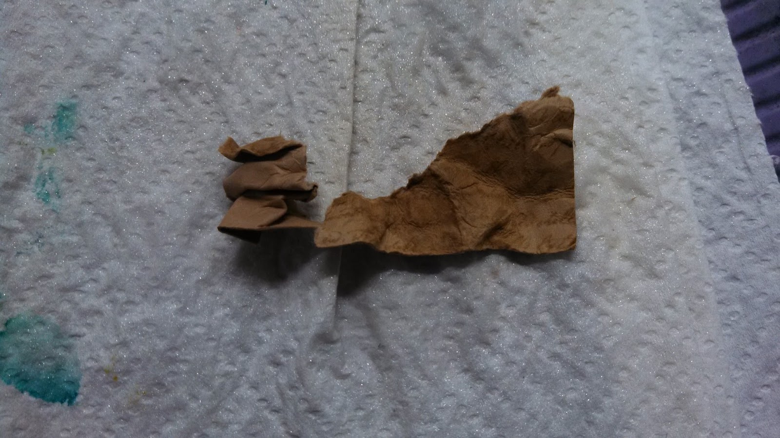
Mist with water to help soften card stock.

Crumple card stock by screwing it up until your happy with it.

Sponge a little Baked Brown Sugar ink onto the cs rocks.


Glue the cs rocks onto the card.


Rock & Roll the shell.
First ink up the shell in Crisp Cantaloupe ink, then roll edges of the stamp onto the calypso carol ink pad.

Rock & Roll Shells.
I'm not sure if you can see properly in the photo, but the shell is darker on the outside.


Fussy cut the shell.

Spritz with some shimmer. I used White Frost. Let it dry.

Glue the shell onto the card. I liked the idea that it looks like the bubbles are coming from the shell.
Oh...I also added a pearl to the shell later, but forgot to take a photo of that too... Sorry.